About work
CLIENT
HUGO + MODIVO
Service
Production
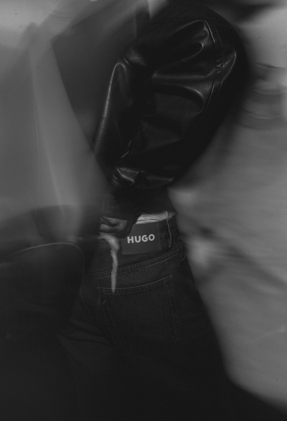
For the HUGO WI26 collection presentation with MODIVO, we took over Studio Jaskółka in Warsaw and built an experience around the brand’s global campaign, RED MEANS GO.
The starting point was simple: take the campaign’s visual language and make it physical. Red became more than a colour. It defined the atmosphere, the space and the way guests experienced the collection


Working with set designer Nina Utrata, we developed a stripped-back, industrial environment where chrome clothing racks, red welding foil, metal surfaces and a statement latex armchair created a sharp contrast between raw materials and fashion. Large screens brought the global campaign into the space through photography, moving images and bold statements. The collection remained at the centre, surrounded by an environment that felt unmistakably HUGO.


highlights
100%
RED MEANS GO
1
VERY RED LATEX ARMCHAIR
0
NEUTRAL BACKGROUNDS
100%
RED MEANS GO
1
VERY RED LATEX ARMCHAIR
0
NEUTRAL BACKGROUNDS


Instead of a conventional showroom presentation, we created a space where every element contributed to the same visual story. The experience brought together fashion, campaign imagery, industrial scenography and carefully selected food and natural wines. Metal serving trays, red accents and minimal styling extended the concept beyond the product display.
WHITE NOISE developed the creative concept and managed the production from initial planning to final execution, including scenography, technical production, catering, influencer relations, guest experience and photo and video coverage. One campaign. One colour. A lot happening behind the red.